Cloud chart font is set automatically according to the given report theme. However, the font and data labels can be edited to adjust the chart's look.
Cloud Chart Formatting
Cloud chart formatting can be adjusted from the Formatting Panel or the Component ribbon.
Formatting Panel
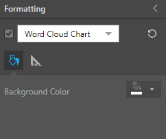
Open the Formatting Panel and choose Word Cloud Chart from the dropdown list.
Fill
- Background Color: Change the color of the Report Background using the Color Picker tool. This change does not affect the chart background.
Settings
Go to the Settings tab to adjust font:
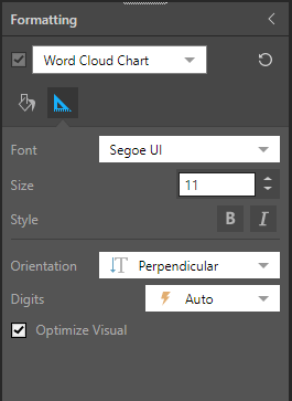
- Font: change the font type.
- Size: change the font size.
- Style: change the font style (bold or italics).
- Orientation: by default, cloud charts display text in both vertical and horizontal orientation. The text orientation in cloud charts can be changed arrange the text in three different ways: perpendicular, random, or horizontal.
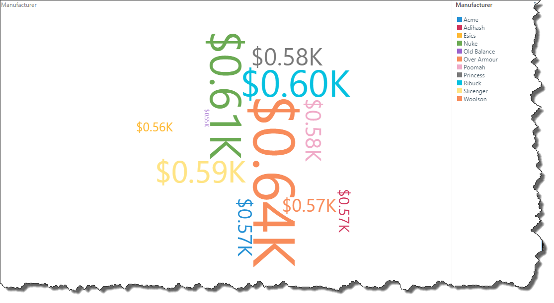
- Significant Digit: this option is relevant only if no hierarchy is added to the Categories drop zone; in this case, the values will be displayed in the word cloud (rather than hierarchy members), and you can adjust the units for the values according to the following options:
- Auto: designated by the lightning bolt icon, Pyramid will automatically apply the appropriate formatting.
- Thousands: designated by the "K", values will be formatted in thousands.
- Millions: designated by the "M", values will be formatted in millions.
- Billions: designated by the "B", values will be formatted in billions.
- None: use the formatting configured in the database.
- Optimize Visual: the visual optimization engine in Pyramid is a heuristic that automatically redacts certain parts of a graphical visualization based on the amount of space provided.
Component Ribbon
Font (red highlight below) and orientation (green highlight below) can also be adjusted from the Component ribbon:
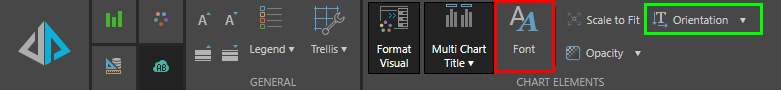
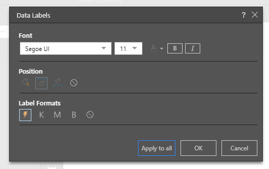
Click the Font button to open the Data Labels dialog, where you can adjust font and label formats:
Here the font type was changed from Segoe UI to Courier New:
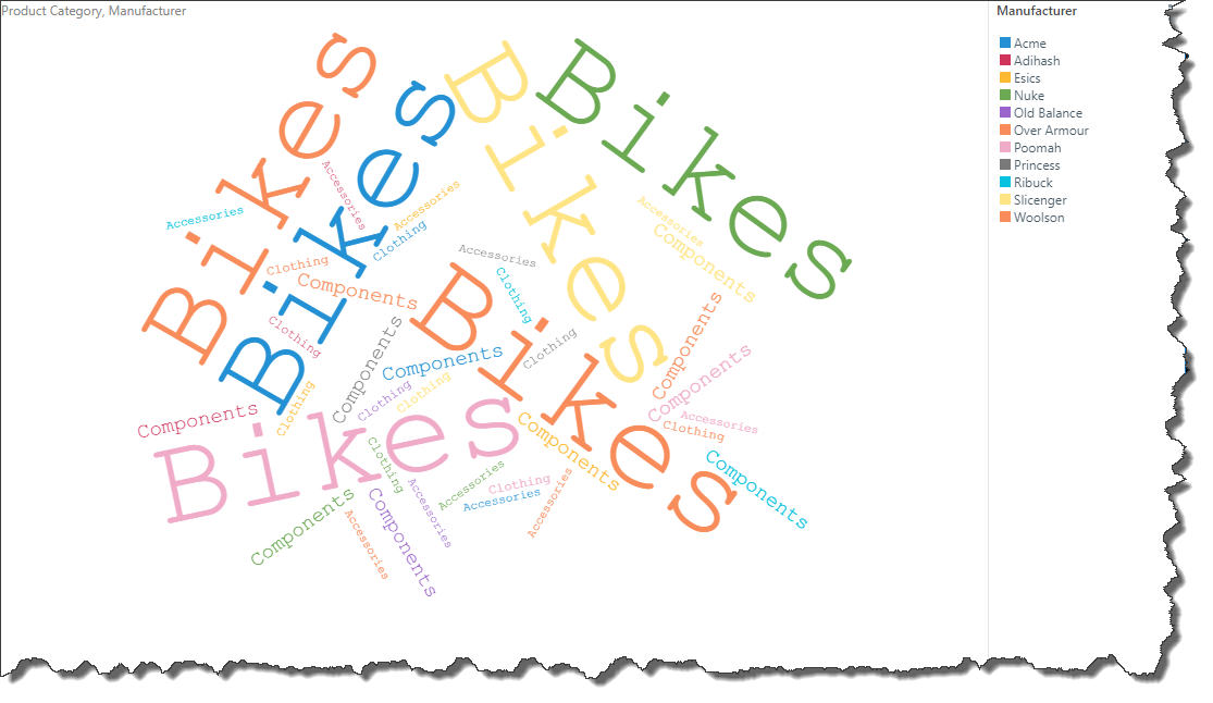
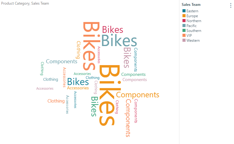
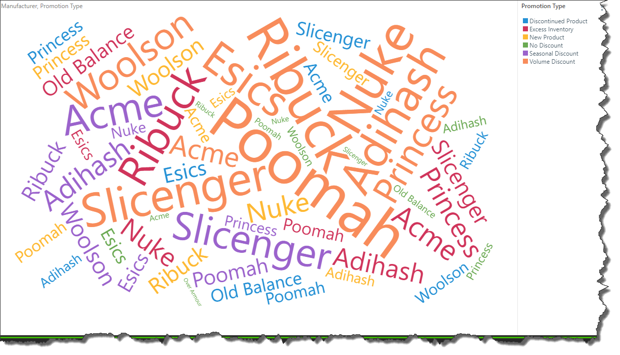
Perpendicular
This example displays the "Perpendicular" orientation; a mix of vertical and horizontal text. This is the default orientation.
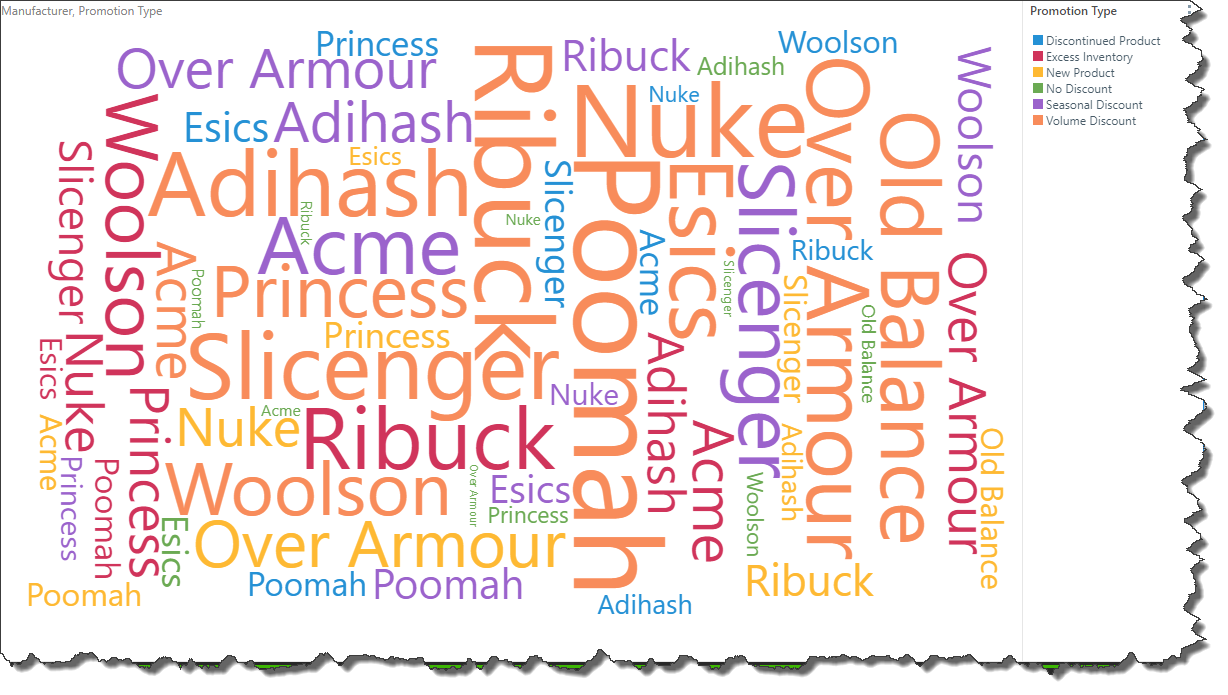
Random
"Random" orientation arranges the text at random angles.
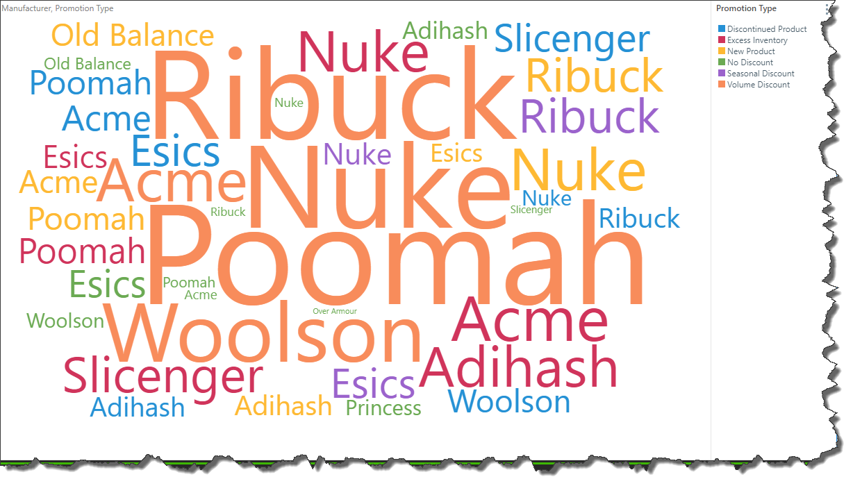
Horizontal
"Horizontal" orientation arranges all text horizontally.
In this example, label formatting was changed from auto to thousands: